Creating a Simple Flash 8 Animation
Like I have been doing for the past few versions of Flash, I have decided that my first tutorial for Flash 8 would be the "Creating a Simple Animation" tutorial. If you are new to Flash or Flash 8, this tutorial will serve as a good introduction to simple animation effects and the tools you will use to create those effects.
Let's get started:
1. First, launch Flash 8. Once you have launched the program, you will see your stage. The stage is the area in the middle that takes up most of your screen. Right click anywhere on your stage and select Document Properties:
2. The Document Properties window should appear. Under Dimensions, enter 300 for the width and 200 for the height. In the text field labeled Frame Rate, enter 25. Press OK to apply those values.
3. Let's add some text to our stage. Click on your Text Tool icon from the toolbox:
4. Once you have clicked the Text Tool icon, place your mouse cursor in your stage, click your mouse and drag to the right. Releasing your mouse after clicking and dragging should create a rectangular area where you can enter your text.
5. Type the word #kirupa. You should see the text you type display in the text field that you have created. After you have entered you word, click outside the text field to finalize the word you entered.
6. Select your "#kirupa" text by clicking on it with your mouse. Look down towards the bottom of your screen where the Properties panel resides. You should see a lot of Properties used for editing text.
7. From your Properties panel, you can adjust the font size, style, and more! Select any font that you like, but set the font size to something large like 36. You can make other text modifications from here also:
8. We are currently working on our main timeline. It will be easier if we convert the text to a movie clip and work from the movie clip's timeline. Make sure your text is selected and press F8 or go to Modify | Convert to Symbol.
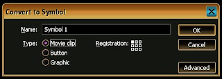
The Convert to Symbol window will appear. Select the option for Movie Clip and press the OK button:
12">
[ from the Convert to Symbol window, select the option for Movie Clip ]
- Once you have converted your text into a movie clip, right click on your text and select the option for Edit in Place. You won't really see anything drastically different, but your timeline is now localized to this movie clip.
- So, as of now, you have created some text, modified it the way you want, and converted it into a movie clip. We want to animate each letter, so let's break our text apart into individual letters. Right click on your text and select "Break Apart".
Your text is now divided by letter:
11. Each of your letter now has its own little box when you select it. Make sure that all of your letters are selected. You can simply select all of the letters by clicking and using the Shift key or just lassoing them by clicking and dragging over all of your letters.
12. Once all of your letters are selected, right click on any of the letters and select "Distribute to Layers." Your timeline should now have one layer dedicated to each letter of your text:
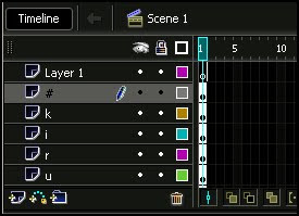
[ how your timeline looks after each letter has been distributed to layers ]
In this page we have created and setup our text so that each letter of text is on its own layer. In the next page I will explain how to animate our letters in our text.
The Timeline
Up until now, we haven't done much work with the timeline. The top half of your Flash window is where the timeline is. Your timeline contains two important things: layers and frames. Your actual animation will be specified in the frames, and the objects that you animate are specified in layers. You'll see what I mean in a minute.
If you have been following the tutorial, more than likely, your layers extend below the timeline - thus requiring you to scroll. That is a minor annoyance that can be rectified by resizing the vertical size of your timeline. You can resize your timeline by clicking on the bottom edge of your timeline and dragging down:
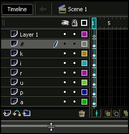
By increasing the size of our timeline, we can easily access all of our layers without requiring much scrolling.
Anyway, I am sure you would want to get back to animating:
1. Find the layer labeled #, and on Frame 10 of that layer, right click and select Insert Keyframe:
2. After you have inserted a keyframe at Frame 10 of your # layer, you will see a solid black black dot at that location. Now, click on the keyframe on Frame 1 of your # layer. You will notice that only your # text is selected in your work area.
3. With your # letter selected, press your left arrow key and move it a little to the left:
4. Now, click on the keyframe you created earlier on Frame 10. Notice that it has the # letter closer to the other letters in its original position. What we need to do is find a smooth way to transition the letter from its new position further left to its original position in Frame 10, closer to the other letters.
5. Click on the keyframe in Frame 1 of your # layer and drag your mouse right until you reach the keyframe in Frame 10 of the same # layer. Frames 1 through 10 should now be highlighted/selected:
6. Right click anywhere on your selected frames and select 'Create Motion Tween'. Click anywhere else on your timeline to remove focus from the 10 frames.
Notice that those 10 frames now have a slight purplish background color applied to them:
7. If you were to drag your timeline slider (the partially transparent red box on the frame labels) between Frames 1 and 10, notice that your # key smoothly moves from left to right in your workspace.
8. No doubt, you would have noticed that all of your other letters disappear when your timeline slider goes beyond Frame 1. That is because we have not defined frames for the layers holding the other letters.
Select the first keyframe on Frame 1 of your k layer and drag diagonally down until you get to Frame 9 of your a letter layer. You should now see a large box of highlighted frames. Right click on any of those frames and select "Insert Frame":
Now that you have frames defined for all of the other layers, notice that when you drag your slider, the other letters remain visible on your stage. We have animated just one letter, so let's animate the rest of them.
9. Let's create keyframes for the remaining letters. Click on Frame 10 of your k layer and drag straight down selecting only all of the Frame 10's in your other layers. Once all of those frames have been selected, right click on your highlighted frames and select Insert Keyframe.
Your timeline should look like the following image:
10. Now, you need to create a motion tween between Frame 1 and Frame 10 of each layer. You can add a motion tween to each layer individually like you did for the # layer, or you can select all the Frames in the k, i, r, u, p, and a layers, right click on the selected frames, and select Create Motion Tween:
11. All of your letters should have a motion tween applied to them now. If you slide your timeline slider, you will see that, while all of your letters display, only the # letter is actually animated. Let's change that.
Make sure your slider is back on Frame 1, and click on the letter k on your stage. Press the up arrow key (or drag the k letter up with your mouse) a few times. Your letter k should be a few pixels above the rest of the letters:
12. Click on letter i, and move it down a few pixels. Move letter r up a few pixels. Alternate the initial position of each letter by moving it up, down, left, or right. Here is how my stage looks like after I adjusted the positions of all the letters:
Preview your animation now by going to File | Publish Preview | HTML. You will see your animation displayed in the browser. Notice that the letters move in from their random positions to spell out #kirupa you had initially.
We now have a simple animation, but it starts and ends abruptly. We will fix that in this page, and since you have some practice with working with your timeline, I will proceed a little faster in covering techniques:
1. In your timeline, insert a keyframe in Frame 20 for all of the letters. You can do that by simply clicking on Frame 20, dragging your mouse down, right clicking on the selected column of frames, and choosing "Insert Keyframe".
After you have done that, you will notice that your newly inserted keyframes are automatically a part of your motion tween:
2. I know this seems repetitive, but insert another layer of keyframes for all of the letters in Frame 30. Here is why this is being done. The first ten frames will fade your letters in, the second ten frames will display your letters, and the third section of ten frames will fade your letters out.
Your timeline after having added the third layer of keyframes should look like the following image:
3. So...let's add more keyframes. No, I'm just joking! We are done adding keyframes. Make sure your timeline slider is on Frame 30. If you look at your stage, you will see all of your letters neatly arranged.
Similar to what you did for Frame 1, move all of the letters around your stage. Here is how my letters look on Frame 30:
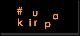
[ letter arrangement on Frame 30 ]
4. Let's preview our animation so far. Instead of previewing the animation in a browser, let's preview it from within Flash. Click anywhere in Frame 1 and press Enter, and you will see how your animation looks from within Flash itself. Looks pretty neat, doesn't it?
5. There is still some further refinements we can do. A fade-in and fade-out similar to my animation you saw on the first page of this tutorial would be really nice.
Click anywhere on Frame 1. Select all of your letters on the stage. Once you have selected all of your letters, look down at your Properties panel. Click on the drop-down menu labeled Color: and select the item for Alpha:
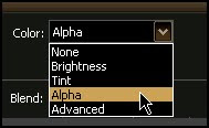
[ select the item for Alpha from the Color drop-down menu ]
6. Once you have selected the Alpha menu-item, you should see another text-field appear on the right with a number. Enter a value of 0
7. Let us repeat the above few steps for Frame 30. Click on Frame 30 in your timeline, select all of the letters on your stage, change the value of Alpha from the Properties Panel to 0. This is just what you did to the letters on Frame 1, with the only difference being you are on Frame 30 now.
8. Let's preview our animation again. Instead of testing in our browser or from within our timeline, let's test in the Flash player. Press Ctrl + Enter or go to Control | Test Movie.
The Flash Player appears with a preview of your animation. Notice that our text fades in and fades out thanks to the Alpha modifications we made from this page.
The last thing we need to do is add a drop shadow to our letters.
If you recall, in the first page, I had you convert your text into a movie clip. It might have seemed like a redundant step, for we were still using the timeline and nothing much looked different.
What the difference is, though, is that all of our animation and frames are self-contained within this movie clip. If I wanted to shift all of our letters over a bit, it would be a painful process to change each letter at each keyframe to meet our new location. The same applies for special effects and filters. It would be time-consuming to add a filter to every letter in every keyframe.
That is where the movie clip comes into play. Above your timeline, click on the Scene 1 tab:
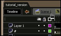
[ click on your Scene 1 tab ]
Notice that you are now back in your main timeline. Normally, the first frame of contents in any nested movie clip would be displayed. Since we set the alpha of all of our letters to 0 on the first frame of our movie clip, you don't see anything.
You can fix that by pressing Ctrl + A or by going to Edit | Select All. Your movie clip should now be selected. Use your arrow keys to move the movie clip to a new location, for example, bottom-right:
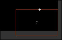
[ our movie clip moved to the bottom-right of our screen ]
If you preview your animation by pressing Ctrl + Enter, notice that all of our letters are now centralized to the bottom-left location. You did not have to go through and edit each letter individually. You simply shifted the container that held all of those letters to the new location instead.
Now, let us get back to adding the cool drop shadows to our animation!
1. Make sure your movie clip is selected. Since it isn't visible, you may have to press Ctrl + A, go to Edit | Select All, or simply draw a large enough selection box on your stage with your mouse by clicking and dragging on an empty area in your stage.
2. Once your movie clip is selected, press Ctrl + C or go to Edit | Copy. This copies your movie clip into memory.
3. We want to paste this movie clip onto a different layer. Right click on the Layer 1 layer on your timeline and select "Insert Layer":
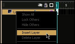
[ insert a new layer in your timeline ]
4. The new layer would have been created above Layer 1. Click on your new Layer and drag it down so that it is positioned below Layer 1. With that done, click on the second circle indicating Lock Layer in Layer 1. Your timeline should look like the following image:
Locking Layers
When you lock a layer, you ensure that any objects on the stage in your layer can no longer be selected. That is useful when you are working with objects (movie clips in our case) that will be arranged behind another movie clip. Locking the movie clip on the top ensures that you don't accidentally select and modify the wrong movie clip.
5. Select the empty keyframe in your newly created layer, and press Ctrl + Shift + V or go to Edit | Paste in Place. You will see that the movie clip you copied a few steps earlier is now pasted in the same location you originally copied from.
6. Make sure the movie clip is selected, and in your Properties Panel, click on the Filters tab. You should see a small white text area with a blue plus graphic. Click on the plus graphic and select the option for Drop Shadow:
7. Your Properties Panel will now provide you with parameters of your drop shadow you can adjust. The default values are good, but the one modification I made was changing the color of the drop shadow from black to a medium gray.
Also, this is really important, make sure the check the box for Hide Object
8. Now, preview your animation. Notice that your text now has a drop shadow attached to it! Our drop shadow is not angled though, so let's implement that feature.
9. Right click on your movie clip and select the menu item for Free Transform. Your movie clip should now have a series of boxes placed on its edges:
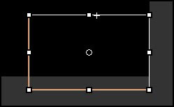
11. Let's resize the movie clip now. Click on either of the top/bottom center square and drag towards the center of your movie clip. You will notice that your movie clip shrinks a bit.
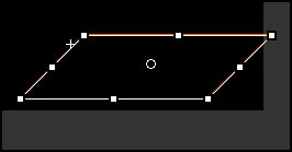
Your movie clip should be shaped similar to the following image:
You are now done with creating a simple animation in Flash 8 that employed many interesting features from Flash 8! This tutorial is by no means comprehensive, and there are a lot of useful features that I hope to cover in future tutorials.


